
There are opinions, and there are prices. Let’s go through opinions first. The general theme nowadays is who’ll lead the recovery from the pandemic and how soon the economy will reach pre-pandemic levels.
The US President promotes his infrastructure plan and the vaccination program. Arguably, the US reopening is rather driven by the economy’s inability to sustain itself without stimulus checks than genuinely improved health conditions.
The number of forecasters, including IMF and Russell Investments, expects the US GDP to skyrocket over 6% in 2021.
The upcoming hard data will be crucial to building the factual ground for the projections. The US CPI data release on Tuesday should be one of those, and the inflation can indicate whether the economy indeed shows signs of recovery.
For now, let’s delve into what prices are telling us.
Deciphering the risk sentiment
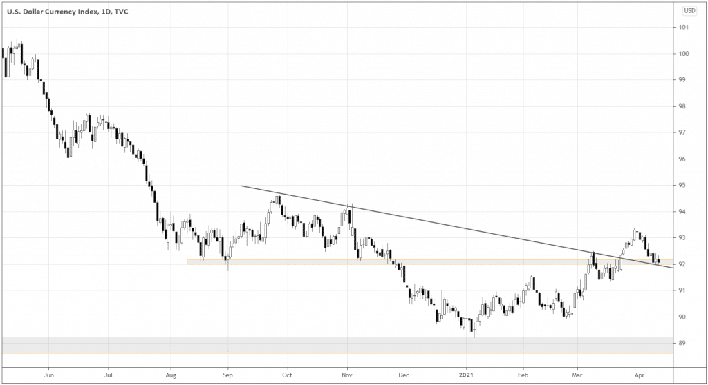
Although the dollar got weaker last week, possibly hinting at the comeback of the risk sentiment, it’s still too soon to leave the trenches and attack risk assets all the way.
DXY would really have to persevere to continue the long-term downtrend. The first sign of success would be the breakdown of the 92.0 support.
Let’s look at the AUDJPY Forex pair and Copper versus Gold ratio to shed more light on the sentiment. When investors are brave and believe the economy is expanding, they tend to push these instruments higher.
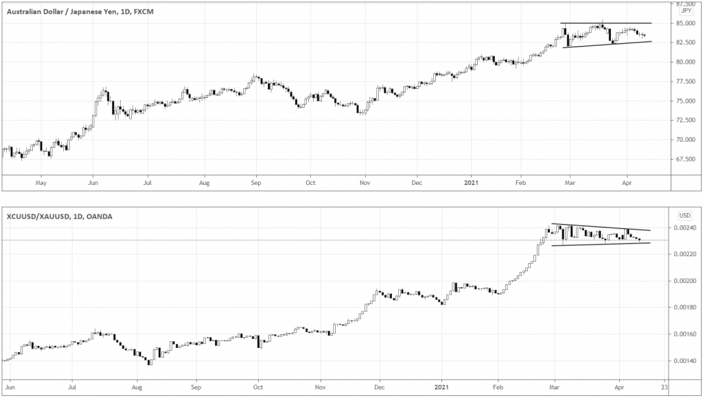
AUD is a traditional risk currency, and Copper is one of the key industrial commodities that are usually in demand during economic expansion.
In the charts above, you can see that both instruments are consolidating within the overall uptrend context. The breakout above an upper boundary of the consolidation would be a dead-serious sign that the market is ready to build a new leg higher.
The breakdown of the lower boundary would be a reason for concern.
Growth or value?
If we want to buy equities, it’s always good to know which kind is likely to outperform. When the market goes up, generally, most of the stocks follow. However, some grow more and others less.
We want to filter the market down to the stocks that are the most promising.
Let’s dive right into it. The first step is to find what group is stronger now: growth or value stocks.
Below is the ratio of iShares Russell 1000 Growth ETF versus iShares Russell 1000 Value ETF.
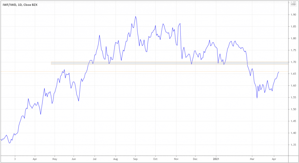
After the ratio broke down at 1.7 level, the decline stalled, and the ratio is coming back to 1.7, indicating that Growth stocks are in favor. The breakout above 1.7 would accelerate growth stocks. The signs of bearish reversal would fuel value stocks.
Another point to consider is consolidating 10 YR yields. At the end of February, yields were negatively correlated with growth stocks that are expressed through Nasdaq100 (see the grey indicator window).
Now it seems like a negative correlation is coming back as the indicator recently crossed below zero.
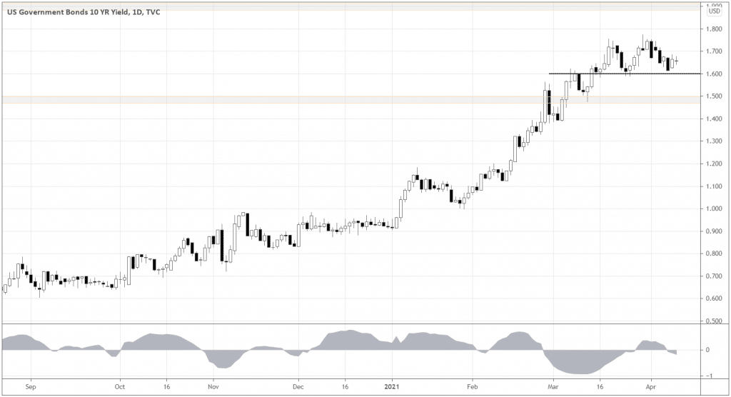
If the rates retrace below 1.6%, techs may start outperforming.
Finally, below is the ratio of SPY (S&P 500 ETF) versus QQQ (Nasdaq100 ETF). The Tech index here represents growth companies.
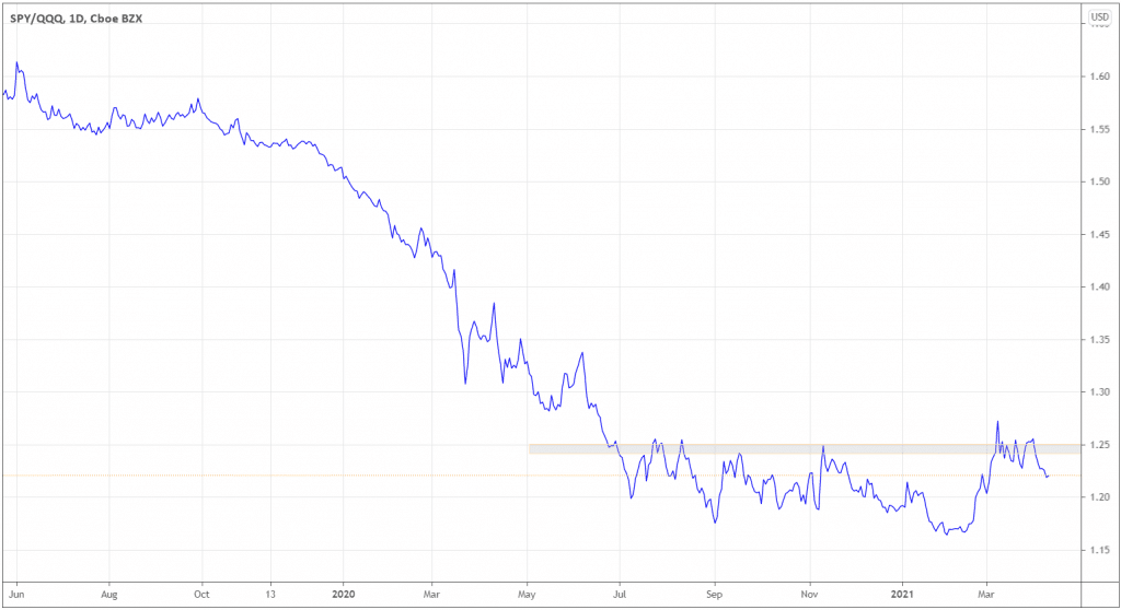
The chart shows that, indeed, techs (QQQ) are poised to outperform at least in the short-term, as SPY squeezed above 1.25, and crashed below, having room for further decline, thus strengthening techs.
What caps are stronger?
The next step is to find what size of companies we’re interested in. The SPY versus IWM (iShares Russell 2000 ETF) does the job.
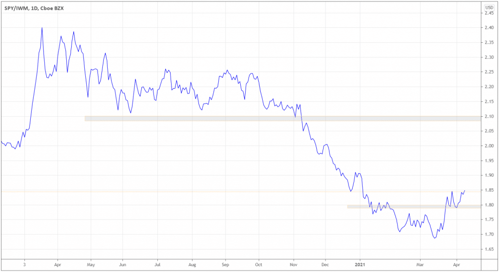
The ratio broke above former highs and 1.8 key levels, indicating that big caps are outperforming.
Filter down to big techs
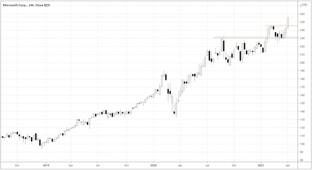
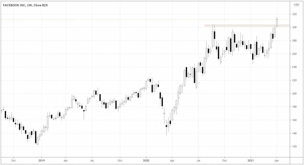
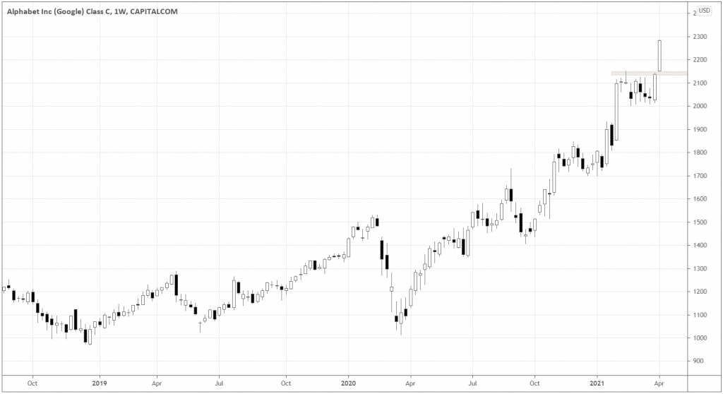
Next, I found three names that are breaking former highs and print new all-time highs: Microsoft, Facebook, and Google.
Their charts speak louder than words. If you look for leaders, here they are.
If you decide to get involved in any of those, watch the Growth/Value (IWF/IWD) ratio and keep an eye on its 1.7 level – it can make or break the momentum in techs.